Design Standards
We have meticulously developed a set of internal standards aimed at optimising the design of training scenarios. Adhering to these standards ensures that your modules are crafted in accordance with the highest design principles. Furthermore, compliance with these guidelines positions your modules favourably for potential submission to the Flow store.
Game Modes
Nodes can be set to be active depending on which game mode is active. To see how that's accomplished see Training, Practice and Assessment
Assisted Learning
Assisted learning is a game mode designed to guide and teach users the correct steps & procedures. They should be guided to locations via teleport points and guided to perform activities such as opening valves with interfaces, overlays, highlights, and informative arrows.
Practice
Practice mode is a game mode designed to test the user’s knowledge on the correct steps & procedures. All guidance such as highlights, user interfaces, & rotational arrows should NOT be available. so features such as interfaces, overlays & highlighted should NOT be available in this mode. The user should be able to perform incorrect steps (Out of sequence steps) to fail, but upon failing, the user will be told they can retry from the last skip point before you failed with the user being taken back to attempt again.
Assessment
Assessment mode is a game mode designed to officially test a user’s knowledge on the correct steps & procedures. They should NOT be guided to perform activities, so features such as interfaces, overlays & highlighted should NOT be available in this mode. To organize an assessment mode session, the user must use the “Portal” for the relevant project and assign the session to them. The user should be able to perform incorrect steps (Out of sequence steps) to fail, but upon failing, the user will be told they have failed, and the session will end, and they will be returned to the lobby. If a session is deemed successfully completed the session in the portal will update as passed and they will be returned to the lobby.
Entering a Module
When entering a module, the user should ALWAYS face the initial user interfaces, even if they have turned around in the lobby physically or using the analogue sticks on the controllers.
To ensure a user is facing the correct way when entering a module make sure to rotate the “Move To Origin” GameObject located under managers in your modules, so that the Z direction is facing how the direction the user should face.
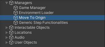
The Move To Origin GameObject as seen in the Interactions Sample Module
User Interface
User Interface Design
User interfaces should use the prefabs already created which uses standard font sizes and style. All text should be block capitals unless specified otherwise. The colour of the sidebar should be the client’s main colour. UI where possible should always be in front of the user, if not it should be to the left of the action/POV of user.
User Interface Placement
User interfaces should be placed at eye level of an average standing person, they should ideally be placed in front of a user at a distance comfortable for reading. In certain scenarios and on certain steps this may not be possible due to artwork, in which case the interface panel should be placed close by the relevant location, to the left or right of the relevant object, and rotated to point towards user location, ensuring legibility. Interface panels should NEVER be placed directly behind a user’s location and should be kept within eyesight of the user
at all possible times. An exception to this is the Failure UI, which automatically places in front of the user and follows their view. Where possible objects surrounding the location should have blockers to prevent clipping.
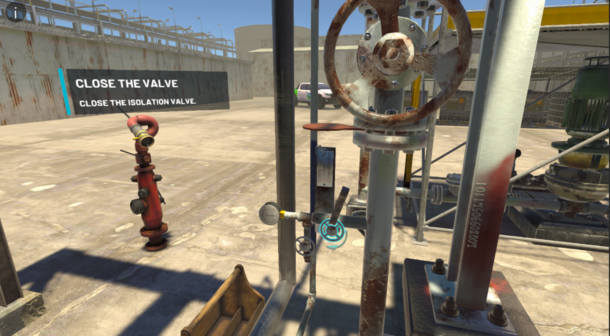
✅ Good UI Placement
This UI is placed correctly. It is at an appropriate distance, at eye level , facing the user and not clipping with any of the environment geometry.
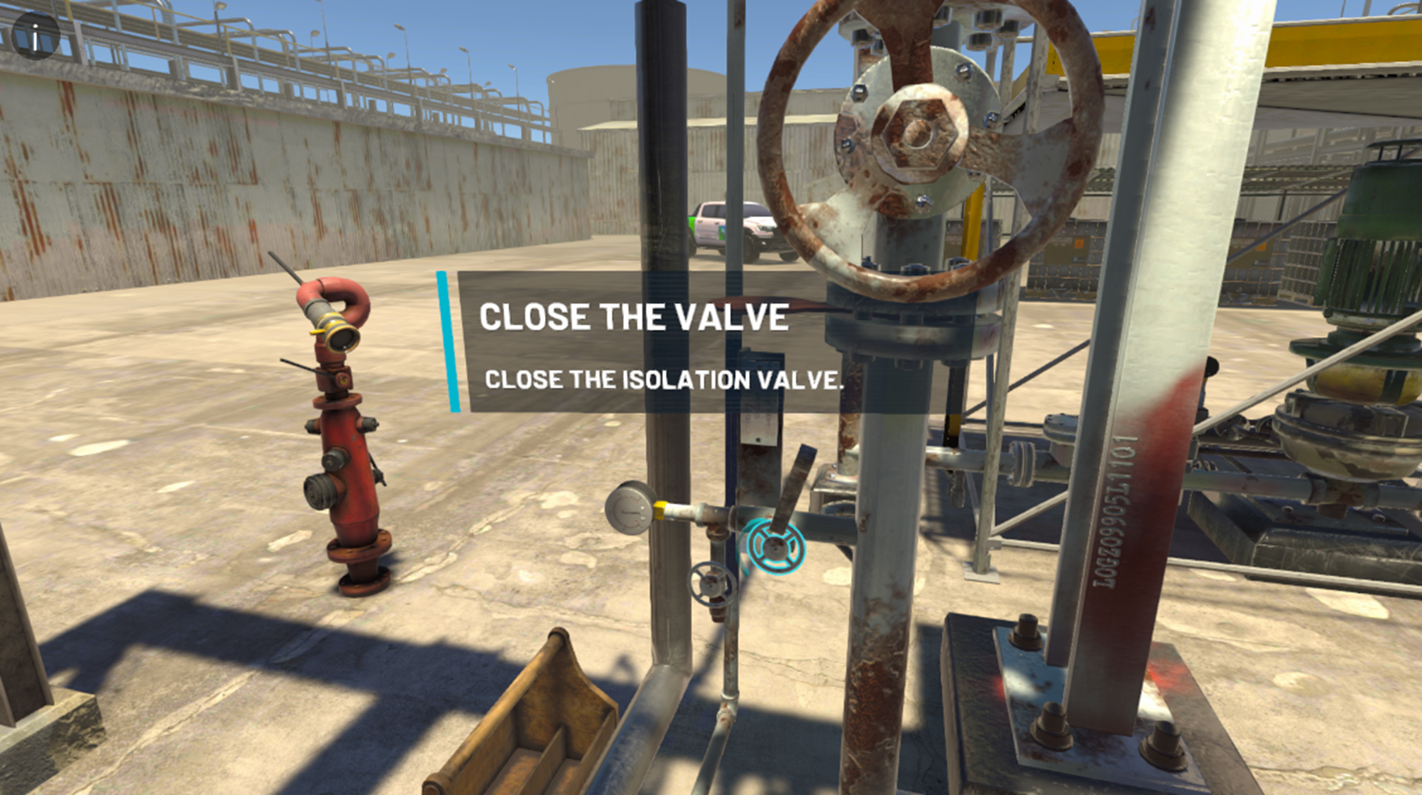
❌ Bad UI Placement
This UI is clipping the environment geometry and placed slightly to low.
TTS (Text to Speech)
All user interface panels should have text-to-speech narration using a neutral voice not used for radio dialogs. Items such as abbreviations should be read out in their full context, i.e “LOTO” in the text would be “Lock-Out, Tag-Out” in the TTS script. Visit the Localisation page to learn how to accomplish this.
Radio Dialogue
When different characters are talking to one another, different voices should be used to differentiate between them.
The title of the individual should be a separate line and client specific colour, the title may be abbreviated but should NOT be read out.
In body text, titles should NOT be abbreviated. An individual's full title should be read out.
Abbreviations should not be pronounced as if they were a word but each individual letter for example LOTO would be read as “Lock-out-Tag-Out”, not “Loh-Toe”.
Characters should also introduce themselves in the first instance of them talking.
An example of this would be “Work permit issuer, this is outside operator, Over.”
You only state who the conversation is between ONCE. You SHOULD restate this if the conversation changes, i.e., some dialogues start with the OO speaking to the SO, then switch to the CRO. At that point you would hear “Supervising Operator to Control Room Operator”
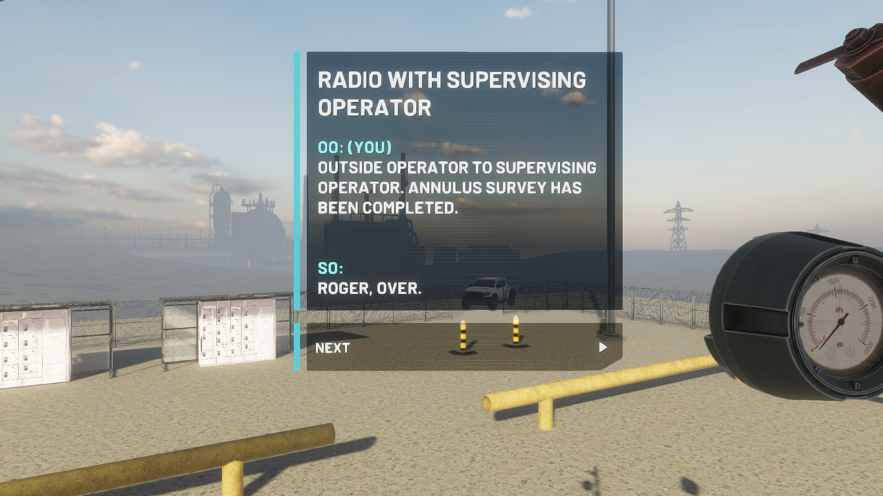
Example of correct formatting for Radio Conversation
Format
The title of those speaking should be in blue as seen.
Simply states who is speaking (OO: SO: CRO:)
This same conversation should SOUND like the following:
“Work Permit issuer, this is outside operator. Over.”
“Go Ahead, Over”
“The affected pump is isolated, free of hydrocarbons, and ready for maintenance. Over.”
“Roger. Over”
So, you only state who the conversation is between ONCE. You only restate this if the conversation changes, i.e., some nodes start with the OO speaking to the SO, then switch to the CRO. At that point you would hear “Supervising Operator to Control Room Operator”
Visit the Localisation page to learn more about formatting your text.
Tools & Objects
Outline Highlights (Assisted Learning mode only)
Tools should be highlighted using a blue outline whenever they need to be used, for example the pipe wrench to remove a plug, radio to initiate a radio dialog, gas detector when taking a reading. The same rationale is to be used for objects a user needs to interact with, such as plugs, hoses or pressure gauges. For example, if the step is to “Remove the plug and place it in your toolbox”, the plug should be highlighted, regardless of if a user has removed a plug in a previous step. To learn more about highlights visit the Highlight Object page.
Tool Use
When a step requires you to perform an action using a tool such as the large or small wheel key, incorporate a “Pick up the wheel key from your toolbox” (Grab) step, then a “Snap the wheel key to the object” (Snap) Step, then a “open/close/crack the valve” (Valve Turn) step, and finally a “Return the wheel key to the toolbox” (Snap) step where relevant.
Other tools that animate to perform a task (Such as the pipe wrench) There should always be the snap to & return to toolbox steps.
Toolbox
In most scenarios a toolbox will be required at relevant steps to hold tools required for the task. This should be positioned near the interactable in question so the user can simply grab a tool from the tool and perform the step, The user SHOULD NOT have to teleport to the toolbox to grab a tool and teleport back. Attempt to have the tool required for the interaction closer to the user where possible. The toolbox should NOT clip into any art or other graphics such as the teleport points.
To setup places the toolbox will teleport to you can add positions to the “Network Tool Box Follower” component. This component will move the toolbox around the area by finding the closest transform to the players position, this can be useful in larger areas.
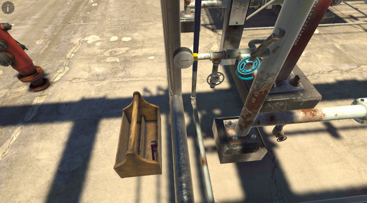
Example showing the toolbox appearing next to where the tools are needed to be used
Snap zone Indicators
The snap zone indicator is a green translucent graphic matching the object that will be snapped in place.
Tools
When a user needs to snap a tool such as a wheel key or a pipe wrench to an object, the snap zone graphic should be on HOVER and not just on by default unless stated/asked for otherwise. The exception to this rule can include things like pressure gauges, funnels, and other objects such as the gas canisters in gas sampling which a user might not know where it snaps to.
Teleporting Basics
To navigate a scenario, teleport points should be used to guide users to the location they need to go to. By default, every interaction point should have a teleport point, and a teleport step should proceed it, the only exception to that rule would be if you are already in position or all the interactable objects are in the same orientation and within 1-2 meters. Make sure to check out the Teleport to Location guide for more information.
These teleport points should follow some basic rules outlined below:
Gantry/Level Teleport Points
Teleport points used to navigate levels such as going up a gantry should be indicated with the teleport point having the Up/down arrow graphic, large and in the centre of the teleport point. These teleport points on the same level as the user should always be active to allow users to traverse levels at will. When teleporting up/down gantry levels, the user should be taken to a logical area near interactable where possible.
Teleporting to the ground will always place the user at the bottom of the ladder of the gantry. UI will tell the user where they need to go such as “Teleport to the top gantry”. No chevron will be present at the base of this teleport point, pointing in the direction you are facing. White spokes should be visible on the base of the teleport.
Example:
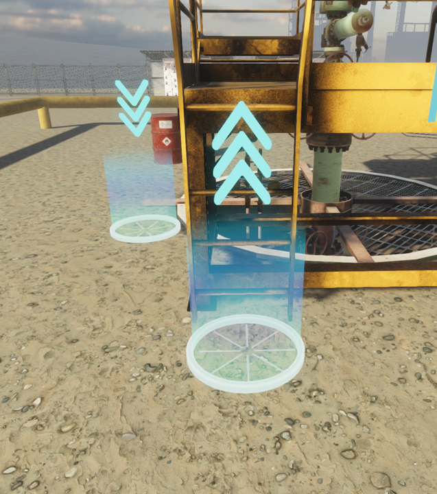
Teleport points with arrows indicating moving up or down a level
Specific Object Teleport Points
Teleport points to teleporting to a specific object such as “teleport to the blowdown valve” should appear in the relevant area on the relevant step. These teleport points SHOULD NOT always be active and should disappear once the step is completed. They should include a small chevron on the base of the teleport point to indicate the direction of view the user will see when teleporting to it.
They should always orient the user towards the relevant object. Where relevant or where the teleport point is far away the UI will denote where the teleport point is located. E.g., “at the back of the heat exchanger”.
Example:
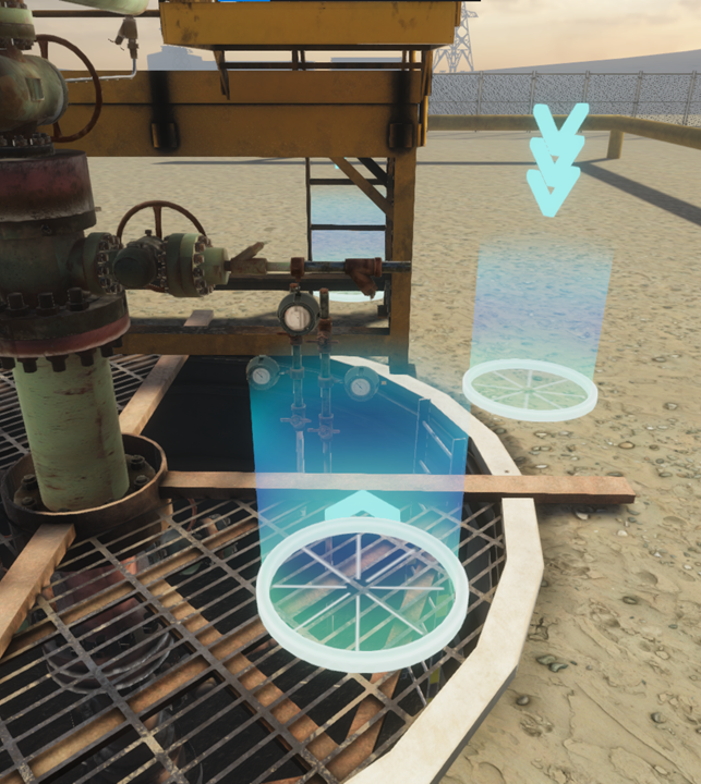
A Teleport aiming at a specific location
Multiuser Placement
When teleporting with multiple users in a session, the “Active” user will always appear at the correct and relevant anchor point, all other users will be force teleported with the active user and placed in a radius around the “Active” user.
Sound Effects
Correct Step Audio
When performing steps correctly in Assisted learning, Practice & Assessment mode, the relevant “Correct Step” audio should sound to give the user a cue that the step has indeed been performed correctly. Having the Bell icon highlight on a Node means it will play a chime when the step is completed. If you wish to change what audio plays at the end of each step you can find this option in Resources → Project Config → Complete Step Audio Clip.
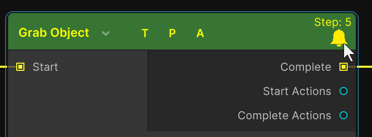
A Grab node with the Bell icon highlighted indicating it will play a charm on completetion
Incorrect Step Audio
When performing a step incorrectly in Practice & Assessment mode, the relevant “Incorrect step” audio should sound to give the user a cue that the step has been performed incorrectly. This is usually done through including a Play Audio Action in the first Fail Track nodes.
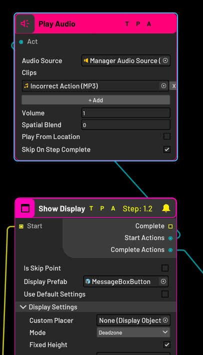
Plays Incorrect Action at Start of Fail Track
Snapping
When snapping items such as tools to a snap zone, an audio sound effect such as metal on metal should play to give the user an indication that a tool has been used/snapped and to increase immersion. This can be achieved by using the Play Audio Action.
Other
Other sound effects can include things like “pump Startup” or “pump shutdown” noises but are relevant on a scenario specific basis and as such outlined on the relevant user flows. This can also be achieved by using the Play Audio Action.
Teleporting
When teleporting, a “Whoosh” sound effect should be heard to indicate a user has teleported. This is already configured for you.
Haptic Feedback
Scenarios should include haptic feedback from the controllers when user perform certain actions. A list of actions which should provide haptic feedback are as follows: UI Elements such as buttons, Grabs, Snaps & Taps and certain use steps. This is already configured for you, but if you wish to change them we use the component UI Feedback Settings for elements. Haptic feedback for interactions is built into the interactions.
Hand Menu
In all scenarios, the user will have access to a hand menu accessed by pressing the left menu button on the controller. This has numerous additional features such as text guidance for the relevant step, multiuser administrator tools, skipping, jumping, restarting, and exiting a menu, depending on the user’s role (Trainee or Trainer) and module entered.
If you wish to see the full documentation on the hand menu you can find that here:
Hand Menu
Skipping
There are options to skip forwards and backwards through the linear flows of modules. Pressing “forwards” on the hand menu will skip the user forwards one step, pressing “Backwards” will skip the user backwards one step. To set a node as “skippable” turn on the “Is Skip Point” checkbox on the corresponding node.
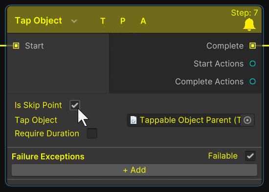
A Tap Object step that can be skipped to
Jumping
Pressing “Jump to” on the hand menu will reveal a series of four options dependent on the module, pressing any of these will “Jump” the user to the relevant step, skipping any steps that may be in between the user’s current step and the destination step. Currently we do not have a system for making more than 4 Jump steps (Without breaking UI boundaries).
Restart
Restarting a module will take the user to the first step in the module, resetting their position to the starting position if necessary.
Exiting
Using the “Exit” button on the hand menu will take the user out of the module and back to the lobby, if a trainer uses the “Exit” button, all users in the same multiuser session will also return to the lobby, if a trainee uses the “Exit” button, it will only remove them.
Users Menu
The user’s menu is another panel with additional features only available in multiuser sessions for trainers, it allows the trainer additional administration controls to manage the session.
Active
By default, all users entering a multiuser session will currently be “Inactive”, essentially locked to only viewing the content and not interacting with objects or interfaces, with the exception being the trainer, the trainer can use the “Active”
button on the user’s menu to enable a user to interact with objects & interfaces in the module.
Highlight
The highlight feature enables a trainer to highlight a specific user in a multiuser
session, when highlighted, a large arrow will appear above the user’s head.
Mute
The mute button allows a trainer to mute individuals in a multiuser session, by default, all users are unmuted.
Remove
The remove button allows a trainer to kick/remove users from a multiuser session if deemed necessary.
Hide
The hide button allows a trainer to hide an individual in a multiuser session, they will remain in the session but hidden from view.
Hand Menu Text Format
Hand menu text can be changed using the Set Hand Menu Text action in the graph.
Title
The title of the hand menu should always be the module in which the user is in. It should always be visible in all game modes.
Step Number
The step number of the hand menu should increase linearly as the user performs steps starting with 1. This should ONLY be visible in Assisted Learning & Practice mode.
Body Text
The body text of the hand menu is used to describe the step the user needs to perform, in general, this can be a copy of the UI body text without the “To Continue” or “Now” but will be available in the user flows in future. This should ONLY be visible in Assisted Learning & Practice.
The Start & end node should follow the “Standard Nodes” not the above standards.
Hand menu in different Modes
The hand menu should alter depending on the game mode the user enters. Variations are outlines below:
Single User
Guided Learning
Forwards, Backwards, Jump to, Restart & Exit
Practice Mode
Forwards, Backwards, Jump to, Restart & Exit
Assessment Mode
Exit
Equipment Identification
Restart, Exit
Troubleshooting
Restart, Exit
Multiuser
In Multiuser, the options on the hand menu depend on the game mode the user enters and the role in which the user has. Variations are outlined below:
Guided learning
Trainer: Users, Forwards, Backwards, Jump to, Restart & Exit
Trainee: Exit
Practice Mode
Trainer: Users, Forwards, Backwards, Jump to, Restart & Exit
Trainee: Exit
Equipment Identification
Trainer: Users, Restart, Exit
Trainee: Exit
Troubleshooting
Trainer: Users, Restart, Exit
Trainee: Exit
Single Player Equipment Identification Hand Menu Example:
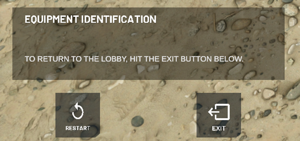
Hand menu in Single Player Equipment Identification
Single Player Assessment Hand Menu Example:
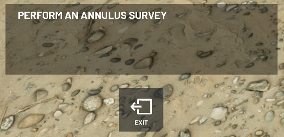
Hand menu in Assessment mode
Single Player Normal Module Hand Menu Example:
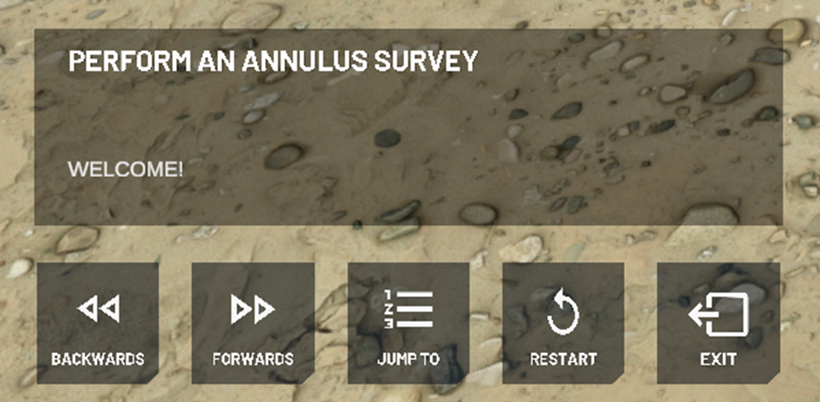
Hand Menu in Training or Practice mode
Multi-user Trainer Hand Menu Example:
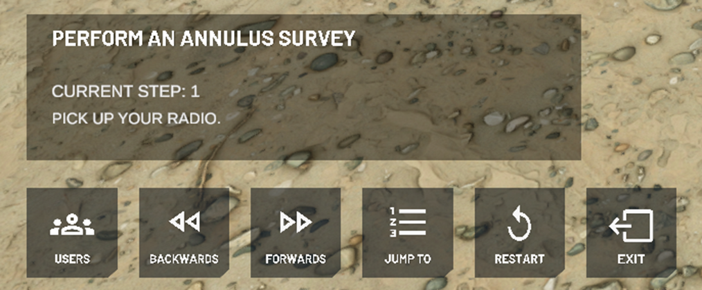
Hand menu of a trainer in multi user mode
Multi-user Trainee Hand Menu Example:
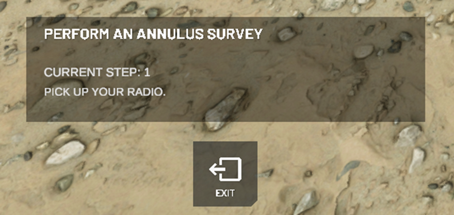
Hand Menu of a trainee in multi user mode
Users Menu Example:
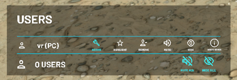
The Users menu option
Standard Nodes
Start Nodes
The user interface & hand menu text for start nodes should follow the following format.
User interface
Title: “Insert module name here”
Body: Welcome to “Insert module name here”. Press “Next” to continue.
Hand menu
Title: “Insert Module Name Here”
Step Number: N/A
Body: Welcome.
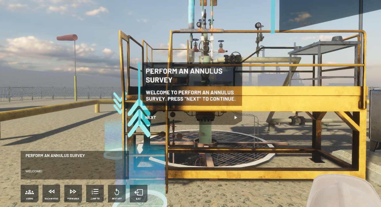
How the UI Text should look for a user first starting a module
End Nodes
The user interface & hand menu text for start nodes should follow the following format.
User interface
Title: Congratulations
Body: You have completed “Insert module name here”. Press “Next” to exit to the lobby.
Hand menu
Title: “Insert Module Name Here”
Step Number: N/A
Body: Congratulations.
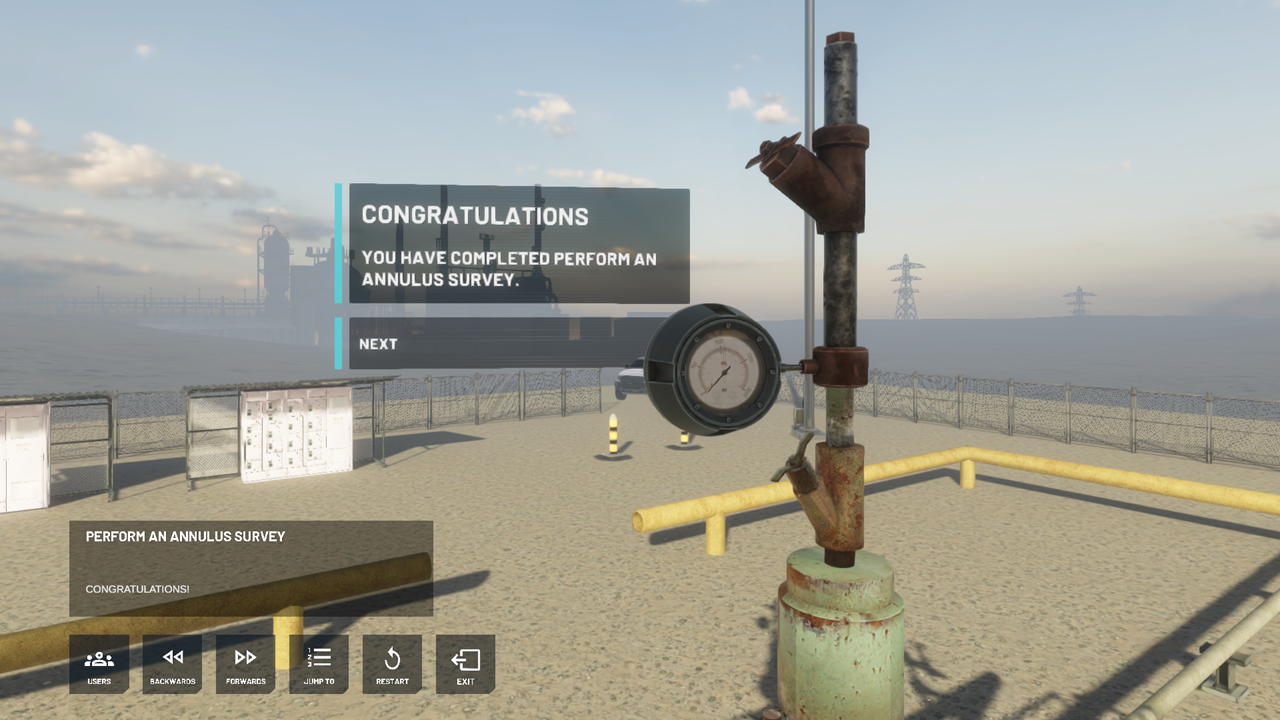
How the UI Text should look for a user who has just completed a module
Teleport Nodes
The user interface & hand menu text for teleport nodes should follow the following format.
User interface
Title: Teleport to the “Insert object name here”.
Body: Teleport to the “Insert object name here” to continue.
Hand menu
Title: “Insert Module Name Here”
Step Number: “Insert Step number here”
Body: Teleport to the “Insert object name here”.
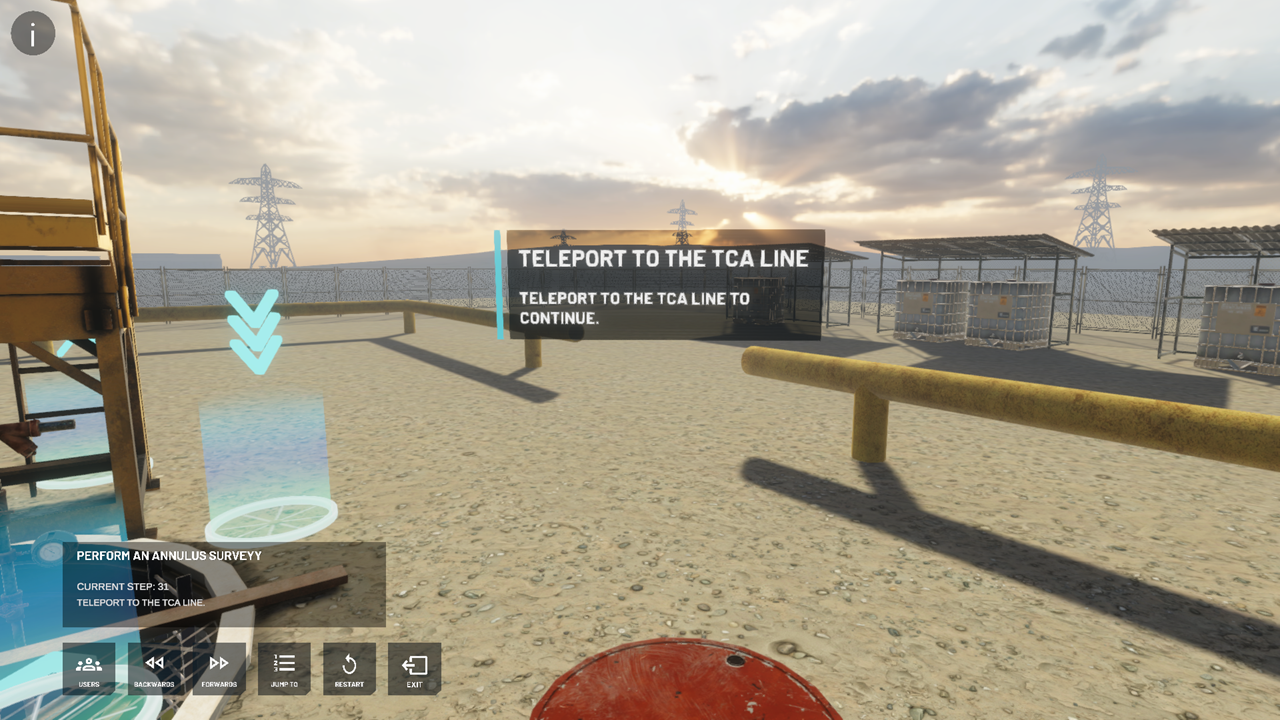
Failures
In practice and assessment mode, a general rule of thumb is that users can fail on steps where they perform an action that is out of sequence or incorrect, such as opening a valve, removing a plug etc.
They should NOT fail on the following: Snapping a wheel key to a valve, teleporting, grabbing their radio or simply grabbing any other tool etc.
They SHOULD fail when they use said tool, such as opening a valve, applying LOTO to a valve, removing LOTO from a valve, snapping the pipe wrench to a plug.
For more information on Failures check out our Failures guide.
Practice Mode Failure UI
“You have performed a step incorrectly; you will be returned to the previous step to attempt again.” There will also be a “Fail Reason” included in the UI denoting why the user has failed, an example being “Reason: Open Blowdown Valve”.
Assessment Mode Failure UI
“You have performed a step incorrectly; you will be returned to the start screen.” There will also be a “Fail Reason” included in the UI denoting why the user has failed, an example being “Reason: Open Blowdown Valve”.
Object Naming
When naming objects in your scene, please ensure to name them correctly, anything that can be interacted with such as snap zones, valves, tools etc. or basically anything with a middleman component MUST have a coherent name & structure, so that when users fail, the failure message is understandable and user friendly.
Conclusion
By following this design guidelines you can ensure your modules are built with consistency and to a high level of usability for your end users. We hope you have found this guide useful and look forward to seeing the scenarios and modules you create with Flow.
